Wednesday, January 27, 2016

Beach Bungalow

Beach Bungalow

Coastal & Traditional Architecture becomes Art


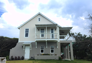
Coastal Bungalow HouseThe word Architecture is so closely tied to Art, one can imagine how many multitudes of young Architecture students grasp at using the term in some entry level class assignment.  I've used the term and words fairly recently myself. What I enjoy about the "Art" in "Architecture", is less about what is left after the house is drawn, and more of the process to get there.

Let's Imagine the process in my little Beach Bungalow (pictured).  There is a couple whom need help designing a home. We will meet to designed on a style that works in the neighborhood, the path of the sun, and fitting it on the lot.  I will have to verify lot coverage through-out the process of design and during this time, begin to work with Engineering & interviewing Builders. Once Design is completed, the Owners will need someone available to help should any construction issues arise.  Between the process of meeting with the "To Be Homeowners" and working closely to select a builder; we begin to design the house, usually using resources the clients have already found and brought in.

The process of review boards, budget meetings, and re-design are all part of a beautiful process it takes to get a custom home off the ground.  That is the "Art" in "Architecture" in my eyes.

Construction: Bosco Co., Atlantic Beach
Engineering: Alexander Grace, Jacksonville Beach


Monday, October 5, 2015

Rendering a Contemporary House

Modern Design Rendering

Contemporary vs Modern vs Classical


In this next part of Renderings & drawings, Sherrod Drawings continues to find fast and accurate renderings to be an integral part of architecture. Today, I would like to explore the several types of ideas in design and explore how renderings can tell a story to the potential client.I see Contemporary Architecture as what is being designed right now. Modern Architecture speaks of design after a certain point and has a look and feel most of us can point out, even if describing it is difficult.

I love the idea of a community where buildings all speak the same language. They have similar stories to tell in the way they look and how they meet the needs of the people they are built for.  So when I see a very "Modern" House slapped onto a street of otherwise very classically designed homes, I see it as an eye sore, a slap in the face to the neighbors.  Instead of a cozy quaint street with rich history in Design you get that one lone duck that Quacks, every time you drive by.

SO the picture following are trying to tell a story, I'd be interested in your interpretation.  Shoot me an email.


That is not to say I have any qualms with modern design.  I find much of it pleasing.  Clean lines and unique features that would not work with a more classically designed structure. Today's Renderings are of a very modern house. With a great view overlooking whatever city you'd like to imagine it to be in. So I experimented in showing off this house and design in a story board.  I will let you decide what you get out of the progressive scenes.

What I do take issue with in Modern Design, is that the buildings seem to represent to mother nature "Look, Look at us being able to construct a cave which rises up out of the ground to heat and cool us while keeping us dry".  We can also take this further and get a feeling that these Modern structures laugh at locally sustainable materials and energy efficiency.  They MUST use central heating and cooling, ignoring the geographical climate.  A big statement from the ego "We're so cool".


The beginning or an evening?
This particular design actually trumps a good portion of those statements I just made.  The Low-E rotating doors allow the house to capture prevalent breezes and a deep over hang give needed shade from the light of the sun.  A flat roof deck above (we can tell because of the stairs in the background) allow for an additional exterior open space ontop while the pool deck has fruit bearing trees planted.

Opening the doors the next morning

So a modern house can be good in the right setting.  Consider the quaint neighborhood I described previously.  Most of the Architecture grows from a learned history of Construction in the area while using local materials.  The learned Construction will include many items that deal with the local geographical climate.  Some of these will be seen in the pitch of the roof, structural materials, exterior coverings and site conditions that all deal with weather, temperatures & climate.

So in the end, make good use of your local materials and design for what the neighborhood wants to say. A good Architect / Designer will help guide in the direction of finding the right design based on many of these parameters and will not make a building go "Quack".

-Michael Sherrod

Wednesday, September 2, 2015

Interior Design Studies

Interior Design Studies

How Small changes make a big difference


In this next part of Renderings & drawings, Sherrod Drawings continues to find fast and accurate renderings to be an integral part of architecture. Today, I am going to look continue to look at the Great House interiors.  In my previous post, we look at exterior renderings for the same building.

The life like renderings below should capture the design and true feel of the built structure. Some of the aspects we are going for when rendering is to capture the scale of the building. In the first "photograph", I wanted to show how large the opening to the dining hall was.  To do this, using people (in this case, a very beautiful client in a blue dress has come for dinner; possibly meeting a date?)  She is obviously flanked by the columns giving the viewer a feel for the height in the structure.

Studio Sky Design, Sherrod Artistry

I did very much the same thing in this second photograph.  Using people as our scale (we all have a very good sense for how large something is when we put a person next to it).  Let's check out another pretty lady in front of the screen door on the left.  She is obviously not three foot tall, so we immediately get the feeling that this door is very tall.  The couple at the bar also show just how high the beams are above their heads.    SO people as scale is a fantastic way to show the size of something and give the "feel" of what we're looking for.

Studio Sky Design, Sherrod Artistry

The 2 Great House renderings above represented about 30 hours of work.  It is 100% digitally composed in a combination of Sketchup with finishing touches in Photoshop. I've drawn upon 30+ years of real life watercolor and painting experience to help with all of these renderings.  What's different when trying to render a scene completely realistic versus an abstract water color (as can be viewed in my last post) is that we have to remember a lot of different invisible variables. Because the two mediums require different expertise.  If you want to learn, you have to do. Pickup a paint brush or download Sketchup's free version and just draw.

Thinking about the different variables between a realistic drawing and a watercolor, using today's example, if we draw the scene too perfect, it will obviously be seen as a fake by our mind's eye, because it is trying to be realistic.  To compensate, I've worked on a few different aspects. Check out the vase in the foreground in the second photograph.  It's slightly off center, giving a feeling of "real life happens".  People come in, move things and someone else has to come back up and put it back, or we get to see a vase that is not perfectly centered.  I also really liked how some of the people in the right hand side of the photo were cut off behind the column.  That's real life. You can't see everything at all times. People move and talk and turn their back to you.  I really wish the lady on the left would face us though, she's absolutely striking, reminding me of a dear old friend back in a tiny little town back in Alabama.

Some of the items I'd like to explore in future renderings: If we look back at the vase, I actually created a vase inside of a vase (using a free Sketchup object as a base).  The outer vase is clear glass while the inner glass, I applied an opaque colored finish.  I'd like to play with the mirrors in the same way.  If you look at your bathroom mirror, you can see the depth of the glass before the light hits the reflective material behind it.  I wonder if that would make a difference, however slight in these renderings.

Some of the other fun items I've played with was colored lighting at the bar. In several instances, the colored lighting from the bar bounces back and shows some reflection in the slightly reflective wood surfaces through out the photos.  I do not think the intensity of the lighting is very realistic on a door or the coffee table.  So I believe another change would be to modify this to a much more defused reflected color, though what do I know compared to rendering engines.  This may actually help the mind to see that there's something else going on, things are not perfect and will help to tie the scene together as being more realistic because it is imperfect; as well as using the same color thought the photo.  So I'll leave it for now.  In my mind's eye, I also expect to see more reflection in the floor from exterior lighting though the french doors. So all of that being said, I could continue to pick this piece apart and never truly be done with it.  So at the end of the day and when "Pencil's up" is called, I think it's good enough.

The lesson I am sharing is that not everything in life is as we "see" them.  Consider a palm tree (if you're lucky enough to live in a tropical climate).  My palms outside are not made of brown trunks with a green canopy.  The trunks are actually grey.  If you look closely at what we THINK something looks like and what something ACTUALLY looks like, you'll finally be find your artist's eye.  I didn't officially go to school for any of this (rendering computer generated scenes like this wasn't even a possibility back in high school, the best we had was Doom). So, keep your eyes open, actually see what is in front of you, can you really see the tree, or are you making it all up as to what you see? i.e... a brown trunk and green leaves.

The end product of any CAD system and drawing mechanisms (which ever you choose to use) should be a beautiful useful end product.  I'm pretty happy with this one.  Pencils up.

-Michael Sherrod

Friday, August 21, 2015

Water Color Renderings

Watercolor in Architecture

Reviewing an old style in a new way


In this next part of Renderings & drawings, Sherrod Drawings continues to find fast and accurate renderings to be an integral part of architecture. Today, I am going to look at the Great House water color recently completed.

Watercolor renderings give a wonderfully romantic and beautiful view of Architectural design.  It allows the viewer to imagine the scene with a light hearted view, as opposed to a strict and harsh judgmental eye. Take a quick look at my past post with a night scene & dusk rendering. Where the building itself is fairly well composed, I can find several key elements that really stir my ire... for instance; the trees in the back and foreground leave much to be desired.  This is from fast drawing and limited resources of hi-quality digital photographs).

Since the digital rendering is so much more life like, it's easier to judge the picture and find faults, it's the minds natural way of working. "Hey", says the brain, "this is close... but I don't want you to be fooled, you know this isn't real and here's why... (dot dot dot)".  So we can appreciate the time put into a drawing, unless it's absolutely perfect, our brains are going to find a way to show us how it is not a real scene. A watercolor rendering (and this one is digital) gives the viewer permission to use their own imagination and "feel" the house as opposed to critiquing it; because the picture is so abstract (not abstract enough that you can not tell what something is) though abstract enough to not trigger the brain into complaining.  Then we are allowed to appreciate and find other emotions associated with the drawing.


Studio Sky Design, Milan Velimirovic Technical, Sherrod Artistry


The Great House rendering above represented about 8 hours of off the clock experimentation in this new style.  It is 100% digitally composed in a combination of Sketchup and Photoshop. I've drawn upon 30+ years of real life watercolor and painting experience.  One of the big things I had to think about, was how do objects actually look and what colors do they give off.  Purple hues on the shadows and blue greens in the distance.  I wanted the clouds to just barely be viewable so as not to be a focal point, though composed in a way, that they work with all the other elements to direct the viewers eye and point to the Great House.

Other elements I've taken from water coloring for years, is the bead around the palms and tree line. In this instance, the bead is prob. a little heavy, though that was on purpose.  I could actually watercolor this scene and have a real one, though time is a huge factor.  From drawing the actual house to sketching in the foliage, it's 8 hours versus 40+.  The question is, is a digital watercolor "good enough"?

The end product of any CAD system and drawing mechanisms (which ever you choose to use) should be a beautiful useful end product.

-Michael Sherrod

Friday, July 31, 2015

More renderings

Renderings & Drawings

New direction for Arch design


In this next part of Renderings & drawings, Sherrod Drawings has found fast and accurate renderings to be an integral part of architecture.  Before the pen hits the paper (or in our brave new world, the first ray is drawn on a blank digital canvas), we have to have an idea of the best way to go about drawing in 3D.  The entire process is far more complicated than just making a pretty picture or straight up 2D drawing.

I basically begin with the foundation in a group and draw up from there.  The model itself is always the base point, keeping as many pieces as possible as components for easy modification during and after client meetings.  There have DEF. been client meetings where we are designing on the fly and completely changing the direction the design is going to head on screen, during the meeting.  This is a far cry from the typical "This is what I came up with and this is what you are going to get" mentality.  A lot has to do with the climate of business in a busy beach town.

I want to stress that accuracy is of the utmost importance in my craft and my work. Something I will always continue to excel in, any problems in field always stem from changes made in field; except one instance a few years ago (2013) where extenuating circumstances caused a slight hiccup during construction, and I'll say the house still came out absolutely beautifully.  (For the record, 4 separate professionals should have all caught the computer error, my faux-pas for being so trusting).

Irregardless.... the end product of any CAD system and drawing mechanisms (which ever you choose to use) should be a beautiful useful end product.  Then comes the next fun part: renderings.  Renderings are life like visualizations of your product (in my case, architectural design).  Below, you will see two times of day, the first is a night scene with the house illuminated, probably for a dinner where the host is having a dinner party.  The next, is where the guests have obviously left all the lights on in the early morning hours.


Starr Sanford Architecture, Sherrod Drawings Technical & Artistry

Starr Sanford Architecture, Sherrod Drawings Technical & Artistry


I personally love the twilight scenes, getting to see the houses during those magical moments of the day when the light is just amazing.

All photographers know there are 2 hours a day... those magic hours when the sun is rising or setting, and the lighting is most dramatic and casts the best shadows.  SO in these renderings, what I can point out is my flaws.  Less flaws and more time constraints.  If you look at the trees on the left had side of the screen (background foliage), they are cut off and look irregular.  The palm trees are not high enough quality and the lighting is a little blown out in both renderings.  It's a trial process, using different plants, creating new ones in photoshop type software and importing into the 3D world. I also think the clouds in the dawn photo are flat and do not give off enough depth.

So to get these 2 renderings probably represent about 12 hours of time rendering, processing, rendering again, fixing mistakes, rendering and processing again.... It's a vicious cycle, though if you love it, the process and the end product, then it's nothing to keep at it.  Thanks Starr Sanford for using my services to help create another beautiful residence!

Wednesday, July 22, 2015

Endless Summer

Magazine Spread

Shameless Self Promotion or discussion on how to get there


Today's submittal is way less about self-promotion and more about a great team brought together to make something amazingly unique and beautiful.  Under the direction of Julia Sanford @ Starr Sanford Design, this team created a stunningly beautiful residence.  Apparently so interesting, Jacksonville magazine decided to cover it in a really great spread this past month.

Take the jump to see more about this project !


What is so great about this particular project, was the local talent.  From the lead designer Julia Sanford, to the technical production & Architecture by Architect Peyman Abadi and Master Builder Jeff Brecko with Aurora, and to continue, we must include the Clients who had the foresight and wisdom to trust their house and design in someone else's hands.


From the before to the after, there is a lot of trust put in a Designer's or Architect's hands.  We are in charge of a family's savings and hard work.  If we go over budget, the project may never even be built, and we have designed for naught.  We also have to be very careful not to over build, or design to show off our own ego.


Great Architecture, should speak of its time and place, but yearn for timelessness -Frank Gehry


One of my favorite Architects (Frank Gehry) speaks so eloquently about the timelessness of our craft.  If the clients with the house pictured above decided to go with a Contemporary home in a traditional neighborhood... how long would any of us love the house? Would the neighbors love us for doing that to their street?  Let's imagine plopping a modern sleek, concrete poured and steel house right in a Classic Beach shingle community.  The house would be so out of place, and the neighbors would probably question our sanity, as well as stir up their Dandruff.  So designing to fit into the surrounding area is super important, we use the local Architectural language of the community to help guide our design, or risk losing neighbors as friends.


I question how long we will have individual Architectural language from each region.  If I were to make a prediction, it is that our Architecture is going to become as homogenized as our commercial landscape in America; countless miles of strip malls and big box stores, all the same in every city.  How long are we going to love this fashion trend in construction?  American's answer is usually just long enough to do some damage; like the suburbs.  Yes, they work well in theory, though totally car dependent, not walkable nor healthy for a true community.  We are turning around slightly.  Walkable communities with an urban shopping center are coming back in vogue.  


So how does this design fit into the neighborhood on a larger scale?  Julie did an amazing job designing this house to help speak the language of Florida's Northern Coast.  This house says "it is a part of the Ponte Vedra beach community and worthwhile".  I wonder what your house says?  Long story short, please do not build the white elephant on the block and Kudos to the design / construction team, as well as the Owner's. It is a beautiful home and a gorgeous story.

Tuesday, July 21, 2015

More Completed Construction

Completed Construction

From 2D to Real D


Today's submittal is a very well designed and built Carriage House in Florida. Working with Starr Sanford Design out of Jax Beach, FL; we accomplished an absolutely beautiful structure.  This 2 Bed, 2 Bath Carriage House features a Full Kitchen and Living room upstairs, while the 3 Bay garage downstairs holds all your toys and leads out to the covered porch on the House's Side entry, creating a fantastic Courtyard effect.

Take the jump to see more about this plan and others !


Subscribe Now: standard